Shogun
Web Development Research
OVERVIEW
Team
Shogun Product Development
Product Type
Web Application
Project Duration
Continuous
Role
UX Researcher
Approach
Discovery Research, Evaluative Research
Tools
Dovetail, Figma, Maze, Fullstory, Pendo, Notion
Methods
In-Depth Interviews, Usability Testing, Product Analytics
Empowering Ecommerce Developers and Administrators to Create Lightning Fast Websites.
Introduction
Shogun Frontend was a Progressive Web Application (PWA) development platform. With PWAs, even content-heavy ecommerce sites load instantly. And in the world of online storefronts, quick load times are directly correlated to higher conversion rates. However, developing PWAs is a huge lift. Developers wrangle large tech stacks and orchestrate them to work harmoniously. Shogun Frontend simplified these development processes by combining numerous technologies into one product.
The Challenge
Shogun Frontend was initially built with limited input from developers and administrators. So while the beta platform provided an all-in-one solution, it also provided a less-than-ideal user experience. As a result, developers were hesitant to sign on and migrate their websites to Shogun Frontend. Additionally, content administrators were less than eager to learn a new management system. The Shogun product team needed to understand why users hesitated to adopt the platform and how they could design it to be user-friendly before Shogun officially launched the PWA platform.
Discovery Research Methods
To understand the Shogun Frontend's initial user experience, I used a mixed-methods approach to gather quantitative data and qualitative insights:
- Usability Testing: to understand the beta user experience, I conducted 30-minute usability tests with 10 developers and 10 administrators. During which participants were asked to complete tasks related to Shogun Frontend's core user flows (building individual web elements, creating an entire webpage, managing a site's content management system).
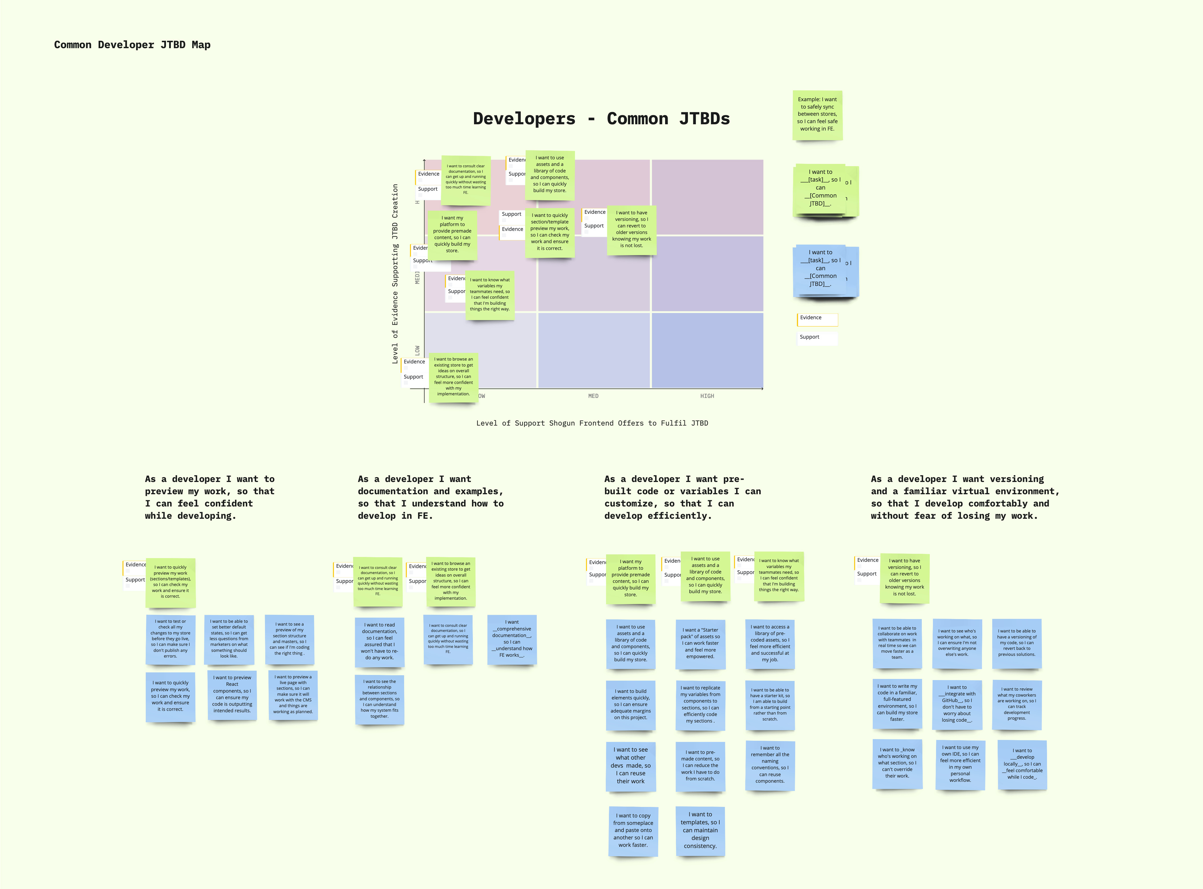
- In-depth Interviews: to dive deeper into the pain points and desires revealed during testing, and to explore their overarching mindsets and Jobs-to-be-Done (JTBD), I moderated 60-minute semi-structured discussions with 5 developers and 5 administrators.
Key Insights
The research revealed two key user needs:
- Developers spent a lot of time building numerous website elements from scratch (product image grids, buttons, navigation bars, etc) and their time and skills could be better spent on specialized development tasks, like creating custom landing pages or integrating third-party APIs.
- Administrators were dependent on developers for even the most minor content updates. But were intimidated by Shogun Frontend's technical interface, they wanted to make changes to their website without needing a high degree of technical knowledge.

An ideation activity to identify product opportunities
The Solution
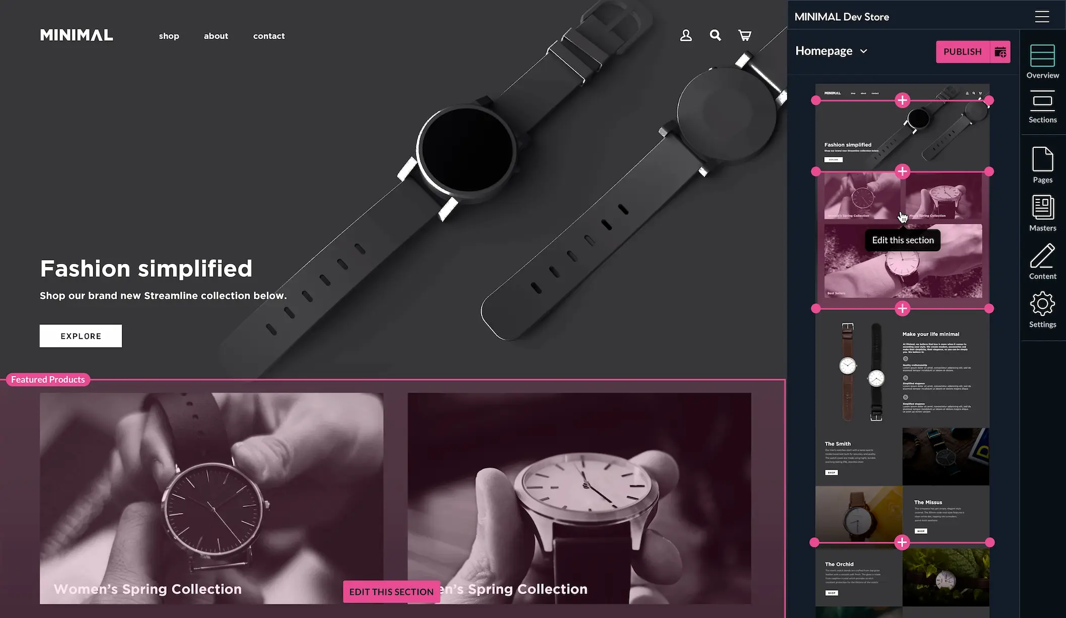
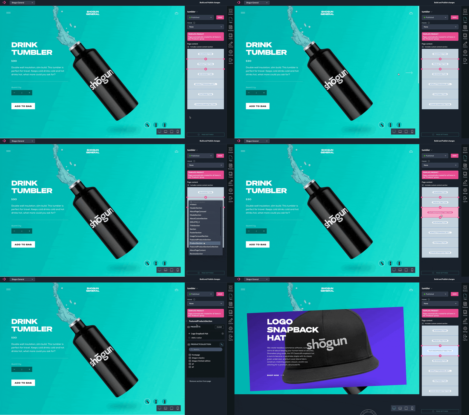
A library of customizable templates and pre-built components for developers, enabling them to spin up webpages quickly. An enhanced visual user interface for administrators, allowing them to manage and update content more clearly. The navigation was also redesigned to be more intuitive and simplify wayfinding.

A visual UI with pre-built web building components
Results and Impact
After shipping the UX updates, I observed better time-on-task metrics and a decrease in user errors. In addition to observing product analytics, I further validated the UX improvements using a Net Promoter Score (NPS) survey to assess user satisfaction. And, from beta to launch, the average NPS increased by 3 points!
Wrap-up
Shogun Frontend was a complex platform with a less-than-ideal user experience that arose, in part, due to its users' nuanced needs and points of view. But that's what makes a human-centered approach to research so clarifying. This research was focused on understanding Shogun Frontend from the perspective of developers and administrators. It revealed human-centered themes and patterns that the Shogun product team took into account to update and improve the platform, increasing satisfaction, scaling the product, and making it faster to shop online.